We believe that a brand is more than just a logo or color palette. It is an embodiment of a company’s mission, values, and the emotional connection it creates with its audience.
When Spark Opportunity approached us for a brand refresh, we knew this would be an exciting opportunity to visually represent the organization’s impact in empowering youth and driving social mobility.
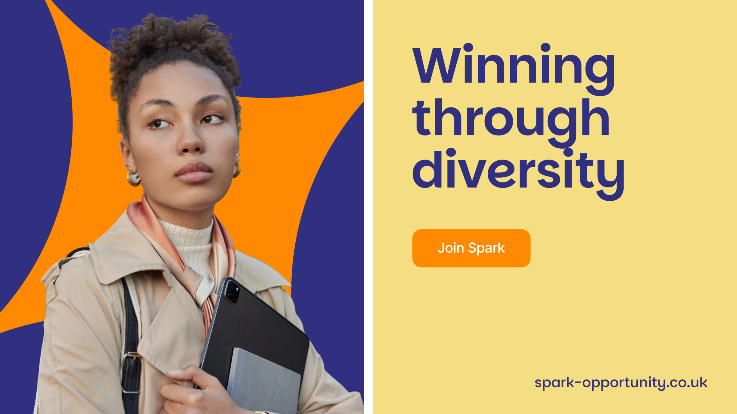
Spark Opportunity’s dedication to helping disadvantaged youth succeed in life and work required a brand identity that was not only bold and modern but also flexible enough to resonate across diverse platforms. We were thrilled to help shape a visual language that communicates their values of resilience, confidence, and opportunity.
The Challenge
Spark Opportunity’s existing branding needed a fresh perspective that could better reflect its dynamic work in education and social impact.
As a non-profit organization that partners with corporates and educational institutions, their brand had to convey a sense of professionalism and trustworthiness while remaining relatable and inspiring to young people.
The challenge was twofold: creating a visual identity that spoke to both youth and corporate partners while maintaining versatility and clarity across various mediums.
Additionally, Spark Opportunity required a consistent and distinctive brand language that could evolve over time and engage their target audiences on digital, print, and physical touchpoints. We needed to ensure their logo, color scheme, and patterns would be cohesive, adaptable, and capable of fostering recognition across all platforms.
Our Process
Our design approach began with a deep dive into Spark Opportunity’s mission, vision, and target audiences. We worked closely with their team to understand the core values they wanted to communicate and the emotions they wished to evoke. From this collaboration, we identified key themes of empowerment, growth, and opportunity, which became the foundation for our creative strategy.
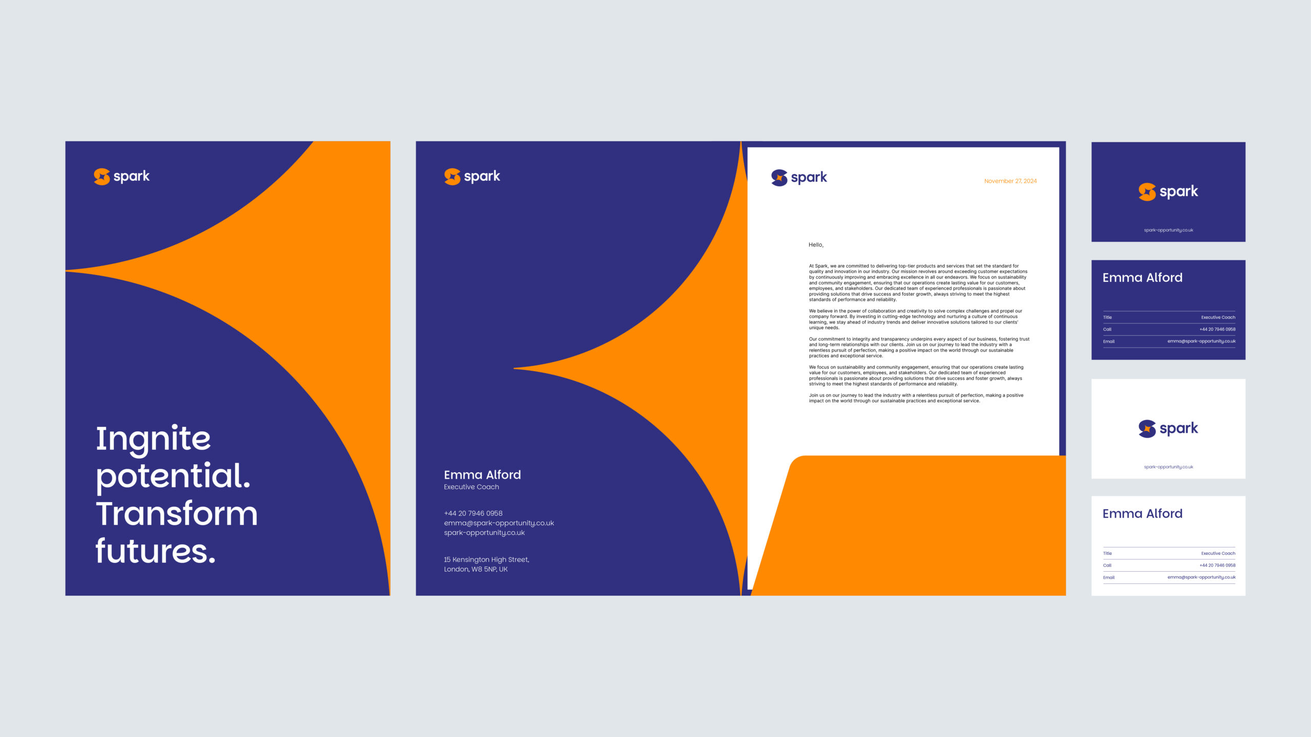
Spark Opportunity’s logo was the starting point for the brand refresh. We refined the logo to ensure it was both modern and timeless, with a clean and confident look that would appeal to a wide range of audiences. We also developed a variety of colour variations to suit different communication needs, ensuring flexibility across both digital and print mediums. The primary colour scheme was established to evoke energy, trust, and clarity and to make the brand instantly recognisable.
Every great brand starts with a conversation
We only take on projects where we know we can deliver real impact. That’s why every journey begins with a quick 15-minute call.
If we’re aligned, the next step is your Brand Blueprint session; your framework for clarity, confidence, and growth.