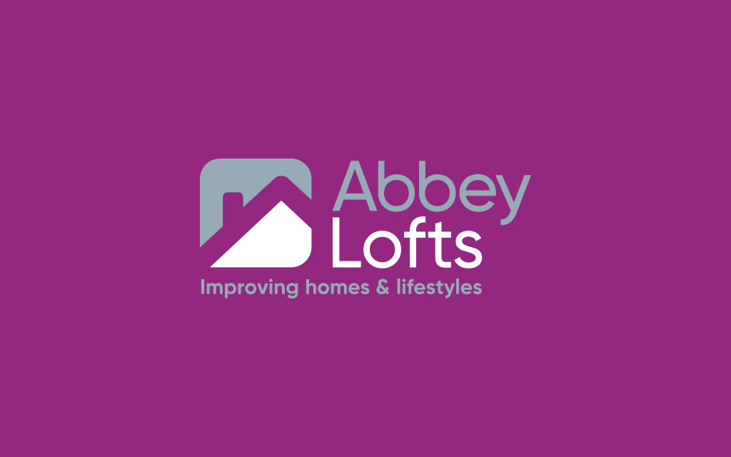
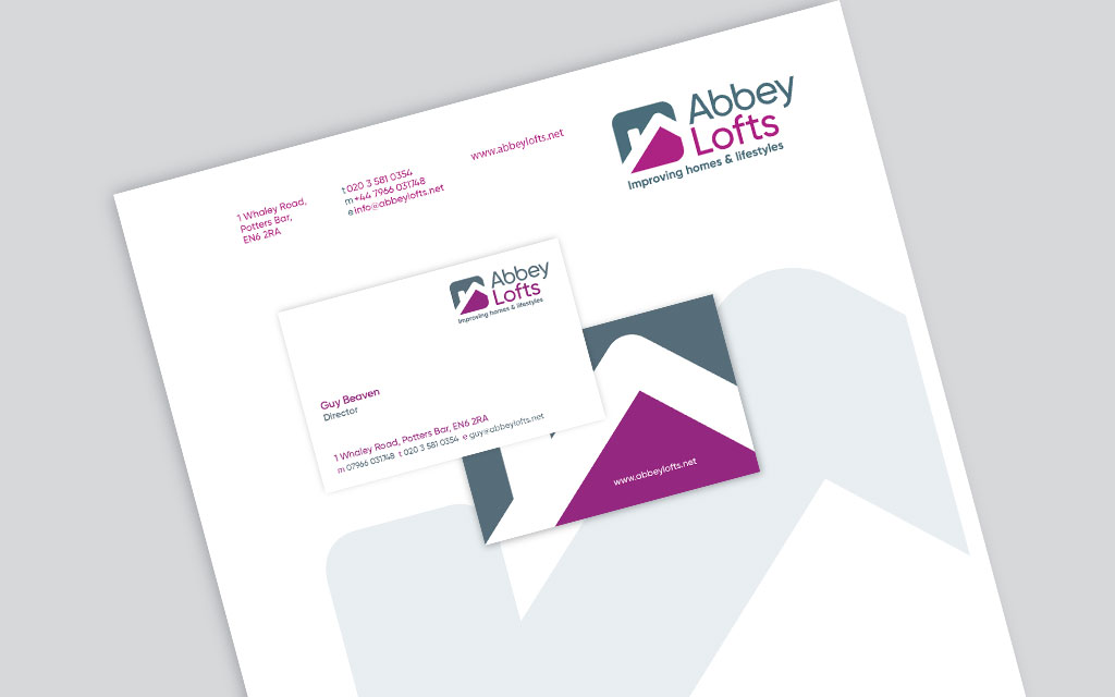
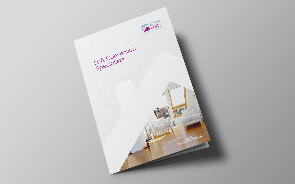
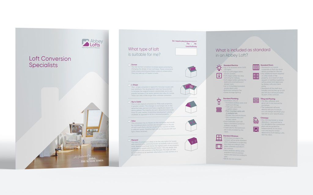
Abbey Lofts of North London required an update to their identity. The company takes pride in offering a creative solution to their customers while providing a reliable and friendly service. They felt approachability was an important part of their ethos and one that should be represented in the branding.
The branding process clarified the core values for the company which not only helped with brand positioning and marketing but also provided a modus operandi for it’s staff.
Case Study
The overall square shape of the logo mark suggests trust and reliability, while the rounded edges and simplicity soften the image making it more approachable/friendly.
Typography was customised to suit the shape of the words and to provide originality.
The two colours were also chosen to emphasise the core values creativity, approachability and reliability.
What the client said...
Managing director Guy Beaven of Abbey Partnership:
Mario worked with us to brand Abbey Lofts. We discussed the company USP and created a brand that not only provided a unique visual style but also strong values which all our staff could get behind. The results brought increased sales and helped us streamline our service.
Case Study
Mario provides a sensitive and well tailored service. He was quick to understand our business and how best to link the consumers with the brand.
Mario has worked together with our companies over many years and we trust his creative design input and approach.
How can we help you?
Click the link below to arrange a 30 minute appointment where we can give you some insights into your brand