Introduction
Gait and Rehab, a podiatry clinic, has built a reputation for delivering expert care with a compassionate touch. Specializing in gait analysis, rehabilitation, and advanced podiatric treatments, the clinic serves a diverse clientele, from athletes seeking peak performance to individuals managing chronic pain. To match their exceptional service, the founders sought a brand identity that captured their professionalism, empathy, and innovative approach to podiatry.
The Challenge
While Gait and Rehab excelled in their field, their existing branding and digital presence lacked the cohesion and impact to reflect their expertise. The challenge was to develop a visual identity that combined a clinical sense of professionalism with the warmth and trust essential in healthcare. It was vital to ensure that every element of their branding, from logo design to digital touchpoints, communicated care, innovation, and reliability.
Our Process
We began by working closely with the founders to define Gait and Rehab’s core values and vision. Through collaborative workshops, we explored their goals, audience needs, and key differentiators through our Brand Blueprint Process. These insights formed the foundation for a brand personality that balanced authority with approachability.
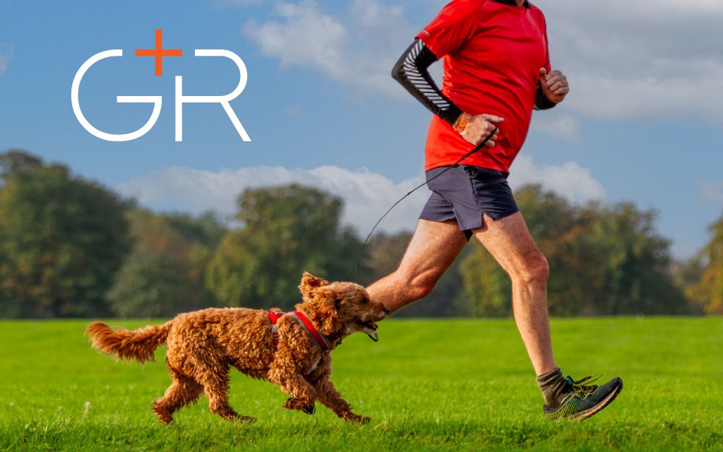
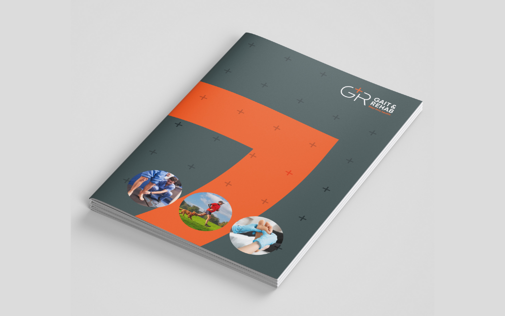
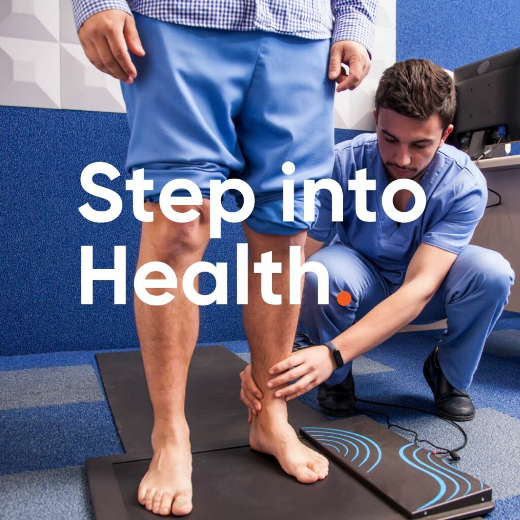
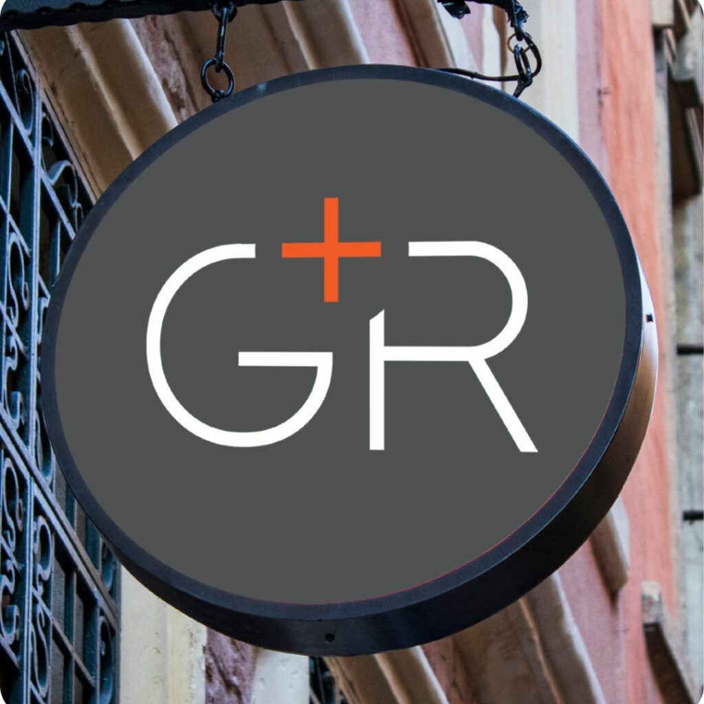
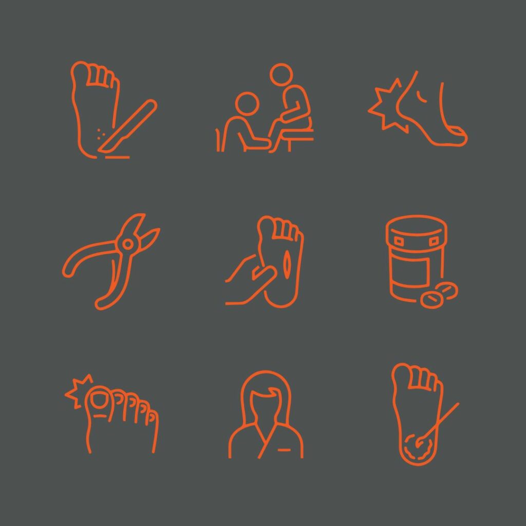
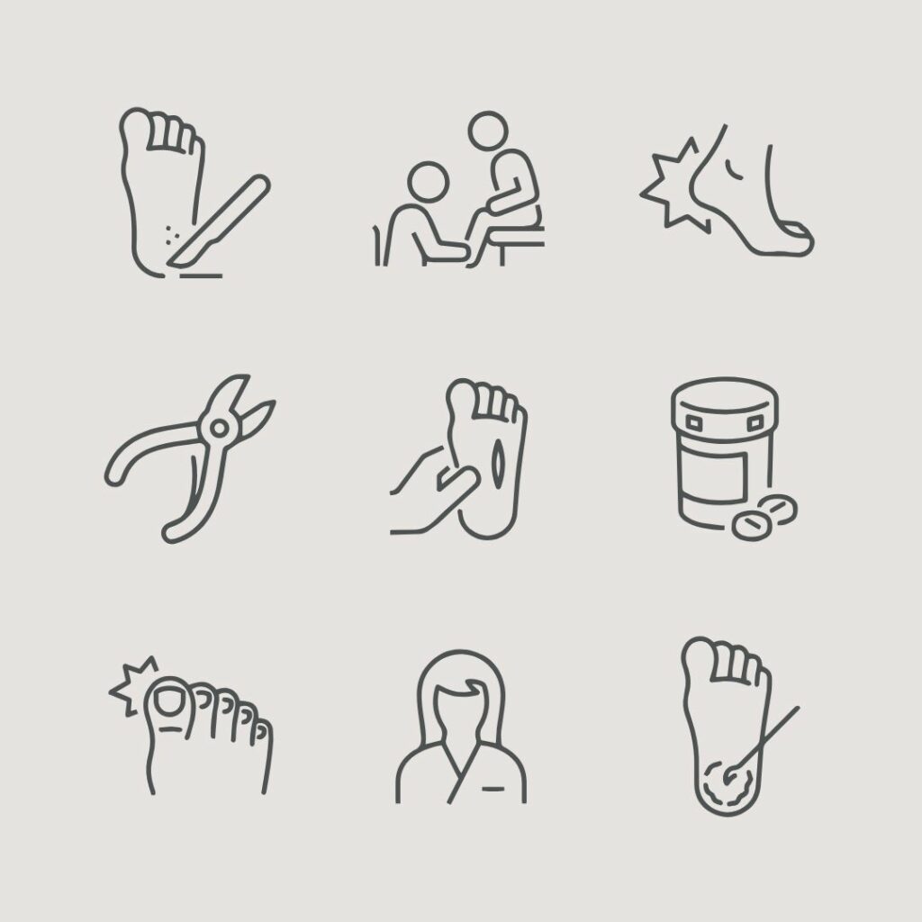
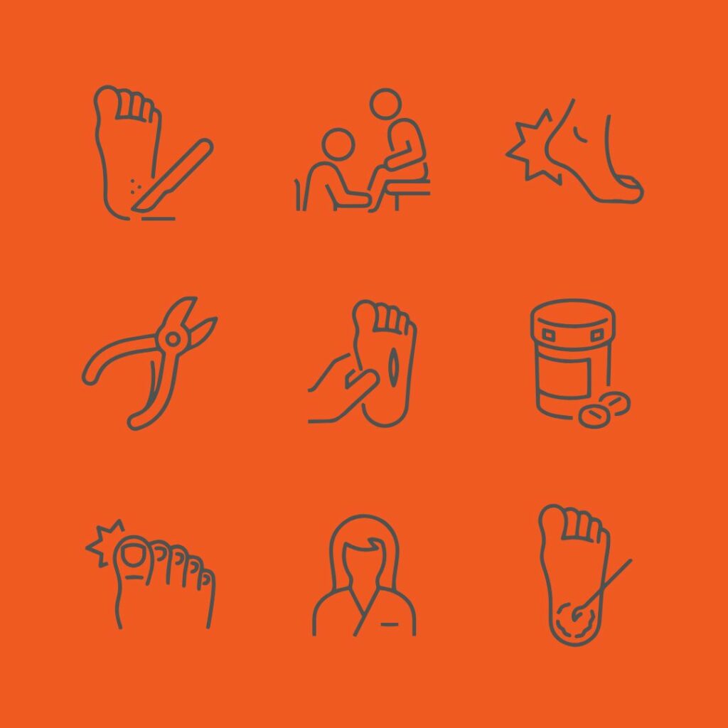
Next, we crafted a visual identity anchored in colors that exuded relatability, complemented by sleek, modern typography and clean design elements. To create a human connection, we incorporated patient-centric photography and illustrations that highlighted the clinic’s focus on individualized care.
The new brand identity and website transformed Gait and Rehab’s presence. The refreshed visuals radiate professionalism and empathy, making a lasting impression on both new and returning patients. Their digital platform now positions them as leaders in podiatry, fostering trust and connection at every interaction.

Client Feedback
I’m so glad we sought out his services to make our brand central to everything we do. It is so much more than just a logo (contrary to our initial thoughts). The detail came from careful questioning and brand identity surveys and evolved into a holistic branding exercise and we absolutely love what Mario has achieved. It’s added a layer of consistency and cohesiveness across our clinic, from internal colour schemes, logo design, marketing and, vinyl products to ensure that we are clear on what our brand stands for and fudamentally WHY we exist. It’s become a whole personality and Kate and I could not be happier.
I would not hesitate to recommend Mario, the quality speaks for itself and we’ve had numerous compliments from external stakeholders already on its style and wow factor. It goes without saying, Mario has been a pleasure to work alongside, his care is evident and passion is infectious.


