New Year, New Spark: Unleash Your Brand’s Purpose Power
New Year, New Spark: Unleash Your Brand’s Purpose Power
New Year, New Spark: Unleash Your Brand’s Purpose Power
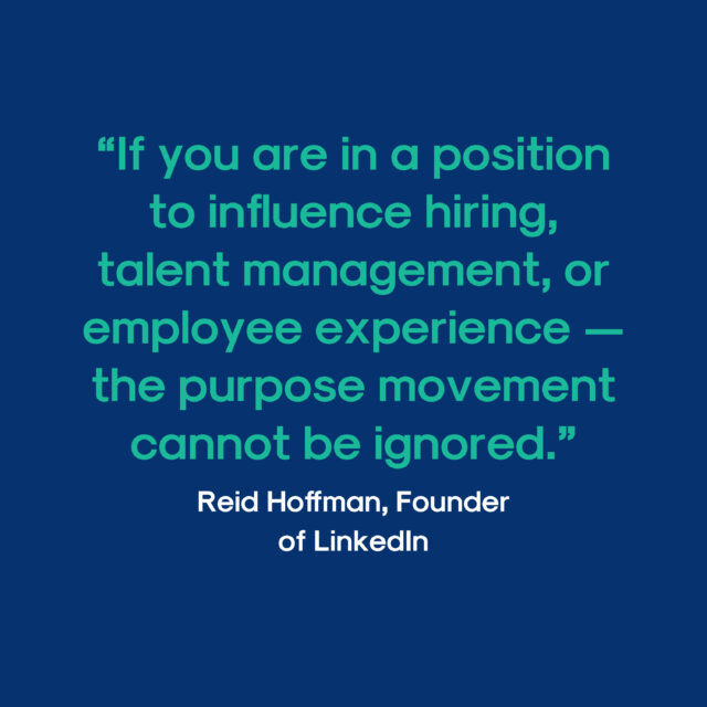
The confetti’s settled, the resolutions scribbled, and a fresh sheet of possibilities crackles in the air. But before you charge into “hustle harder” mode, let’s pause and ask: what fuels your fire?
It’s not just about setting goals, it’s about rediscovering your “why” – the heart that beats behind your brand. Why do you do what you do? What fuels your passion, beyond the bottom line?
In this age of fleeting trends, a crystal-clear “why” is your North Star, guiding your decisions, your message, and even your hires. It’s not just navel-gazing, it’s rocket fuel for success. Here’s why:
Direction: No more “spray and pray” marketing! Your “why” is your compass, steering every choice with purpose.
Connection: People crave authenticity. Show them the soul behind your brand, and watch loyalty soar.
Inspiration: A powerful “why” ignites your team, uniting them in a shared mission and boosting morale. Happy team, happy customers, right?
Differentiation: In a crowded marketplace, your “why” is your superpower. It sets you apart, defines your “what-we-do-better.”
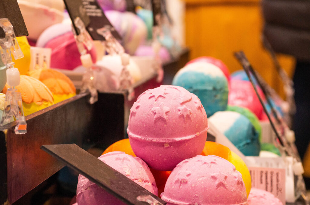
Lush cosmetics grew by going green
Lush is a great example of how purpose can transform a business. Remember the vibrant cosmetics brand with its hand-rolled bath bombs and funky smells?
For years, Lush focused on quirky products and unique experiences. But in 2007, they underwent a “Green Revolution,” putting their environmental and ethical values at the core of their brand identity.
Their “why” transformed from selling soap to saving the planet.
This wasn’t just greenwashing. Lush became vocal about fighting animal testing, reducing plastic waste, and supporting sustainable farming. They embraced transparency, showing every ingredient’s origin and impact.
The results improved their ROI
Customer loyalty skyrocketed. People connected with their values and felt good about supporting a mission-driven brand.
Employee engagement soared. Working for a company with a purpose attracted and motivated top talent.
Sales boomed. Sustainability became trendy, and Lush was at the forefront, attracting new customers who valued ethical products.
Lush’s story is a powerful reminder that communicating your “why” can be a potent marketing tool. It’s not just about profit, it’s about making a difference. When customers and employees believe in your mission, they become passionate advocates, boosting your brand and your bottom line.
Reignite your Brand Spark in 2024
Here’s how to unearth your buried treasure:
Gather your tribe: Brainstorm with your team, customers, even your barista! Fresh perspectives are gold.
Mine your past: What were your founding principles? Have they held true? Revisiting your roots offers valuable insights.
Seek inspiration: Look at brands you admire. How do they communicate their “why”? What can you learn?
Keep it real: Don’t force it. Your purpose should be authentic and true to your core values.
If you are feeling stuck, we are offering brand “why” clarity workshops all January! Email us to reserve your spot and fuel your brand’s purpose fire.
Wishing you a purposeful 2024!
How can we help you?
Click the link below to arrange a 30 minute appointment
where we can give you some insights into your brand
Click the link below to arrange a 30 minute appointment
where we can give you some insights into your brand
Branding specialists will likely begin a conversation about branding with ‘branding is not just a logo’. Ahem, having said that, visual design can have a great impact on your brand.
Lets take a look into the realm of visual design and its transformative impact on branding. Our spotlight shines on two exceptional UK companies—Joe & Seph’s Gourmet Popcorn and Innocent Drinks—unveiling the secret sauce behind their branding triumphs. Get ready for a thrilling exploration of the profound value of visual design!
Why is the visual element of a brand so important?
We often hear the saying, “Don’t judge a book by its cover.” But let’s be real, we’re all guilty of being swayed by aesthetics. In the competitive business landscape, visual design acts as the gateway to capturing attention, communicating brand values, and forging a deep connection with consumers. Here’s how it works:
First Impressions Matter: In the blink of an eye, consumers form opinions about a brand based on visual cues. A well-crafted visual identity grabs attention, piques curiosity, and entices further exploration. It’s the hook that reels people in and invites them to take a closer look.
Building Brand Recognition: Consistency is key. A visually cohesive brand identity, featuring elements like colours, typography, and imagery, reinforces recognition across various touchpoints. When consumers spot your brand’s visual signature, they instantly associate it with the quality and experiences you deliver.
Emotional Engagement: Visual design has the incredible power to evoke emotions and create meaningful connections. By tapping into the psychology of colours, shapes, and imagery, brands can influence perceptions, build trust, and trigger positive emotions. It’s the secret sauce that leaves a lasting impact on consumers’ hearts and minds.
How visual psychology works
Visual psychology, also known as visual perception or visual cognition, explores how the human mind processes and interprets visual information. It encompasses various principles and phenomena that influence how we perceive and make sense of the visual world. Here are some key concepts and mechanisms in visual psychology:
Gestalt Principles: The Gestalt principles describe how humans naturally perceive and organize visual elements. These principles include:
Proximity: Objects that are close to each other are perceived as a group.
Similarity: Objects that share similar attributes (e.g., shape, color, size) are perceived as belonging together.
Continuity: People tend to perceive smooth, continuous lines or patterns, even if they are interrupted.
Closure: When presented with incomplete or ambiguous information, we tend to mentally complete the missing parts.
Figure-Ground: We automatically distinguish objects from their background, perceiving one as the main focus (figure) and the other as the surrounding area (ground).
Visual Hierarchy: Visual hierarchy refers to the arrangement of visual elements in a way that guides the viewer’s attention and understanding. By using techniques such as size, colour, contrast, and positioning, designers can create a hierarchy of importance and direct the viewer’s gaze to key elements or messages.
Colour Psychology: Colors can evoke emotions, associations, and perceptions. Different colours have been shown to have psychological effects on individuals. For example, red can convey excitement or danger, while blue is often associated with calmness or trust. Colour choices in branding and design can influence how people perceive and respond to a brand or message.
Visual Illusions: Visual illusions occur when our perception of an image or object differs from its physical reality. These illusions demonstrate how our brain interprets visual information and can be influenced by factors such as context, contrast, and depth cues. Visual illusions provide insights into the mechanisms of visual perception and the role of the brain in constructing our visual experiences.
Visual Attention: Visual attention refers to the selective focus of our attention on specific visual stimuli. Our attention is drawn to elements that stand out due to factors like colour, contrast, motion, or novelty. Understanding visual attention can help designers and advertisers capture and maintain the viewer’s attention effectively.
Memory and Recall: Visual stimuli are often better remembered and recalled compared to other forms of information. The brain’s ability to form mental images and associations aids in memory encoding and retrieval. Visual cues, such as images or icons, can enhance memory and facilitate information processing and recall.
Visual psychology is a multidisciplinary field that combines cognitive psychology, neuroscience, and design principles to understand how visual information is perceived, processed, and interpreted by individuals. By applying these principles in branding, design, marketing, and user experience, professionals can create visually appealing and effective communications that resonate with the target audience.
It’s important to note that visual psychology works in conjunction with other branding elements, such as messaging, brand values, and customer experience. A comprehensive branding strategy considers how visual elements align with the overall brand identity and how they can evoke the desired emotions, perceptions, and associations in the target audience.
Let’s take a look at an example where visual identity played a significant role in improving brand perception and driving sales.
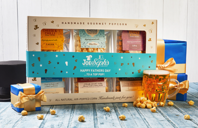
Joe & Seph’s Gourmet Popcorn
is a UK-based gourmet popcorn company known for its innovative flavours and visually appealing packaging.
Unique Flavor Combinations: Joe & Seph’s offers a wide range of unique and inventive popcorn flavours, such as Gin & Tonic, Caramel Macchiato, and Goat Cheese & Black Pepper. The company’s visually distinctive flavour combinations set them apart from traditional popcorn brands and cater to adventurous consumers seeking new taste experiences.
Premium Packaging: Joe & Seph’s pays great attention to its packaging design, opting for a premium look and feel. The popcorn comes in vibrant and eye-catching bags with elegant typography and high-quality graphics. The packaging conveys a sense of indulgence and worthiness, appealing to both personal and gifting markets.
Transparent Production Process: The company emphasizes transparency in its production process, showcasing the quality of their ingredients and the craftsmanship involved. Visual cues, such as images of the popcorn being handmade and descriptions of the natural ingredients used, create trust and authenticity among consumers.
Seasonal and Limited Edition Offerings: Joe & Seph’s regularly introduces seasonal and limited edition flavours, leveraging visual storytelling through packaging design. These special editions feature unique illustrations, patterns, or colour schemes that reflect the theme or occasion, creating excitement and driving impulse purchases.
Online Presence and Branding: Joe & Seph’s maintains a strong online presence, including an engaging website and active social media accounts. They use visually appealing product photography, behind-the-scenes content, and user-generated images to showcase their popcorn and connect with their audience. The visual consistency across their digital platforms reinforces their brand image and encourages online sales.
Through their emphasis on visual identity, Joe & Seph’s has achieved several positive outcomes:
Differentiation: The company’s unique flavour combinations and visually appealing packaging distinguish them from traditional popcorn brands, capturing the attention of consumers seeking gourmet and artisanal options.
Elevated Brand Perception: The premium packaging design and transparent production process contribute to a perception of quality, craftsmanship, and authenticity, enhancing the brand’s image among consumers.
Increased Sales and Brand Loyalty: The visually distinctive packaging, seasonal offerings, and engaging online presence drive customer engagement, repeat purchases, and positive word-of-mouth recommendations, resulting in increased sales and brand loyalty.
The Transformative Magic
Visual design is the unsung hero of branding. It captivates, communicates, and connects. Joe & Seph’s Gourmet Popcorn showcases how harnessing the power of visual design can elevate a brand’s appeal, foster customer loyalty, and drive success. So, embrace the visual magic and unleash your brand’s full potential!
Find out more
Book a call If you would like to know more about how design and branding can transform your business.
How can we help you?
Click the link below to arrange a 30 minute appointment
where we can give you some insights into your brand
Click the link below to arrange a 30 minute appointment
where we can give you some insights into your brand
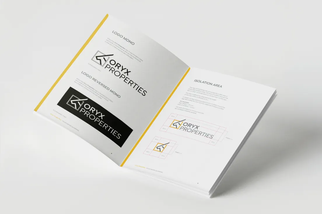
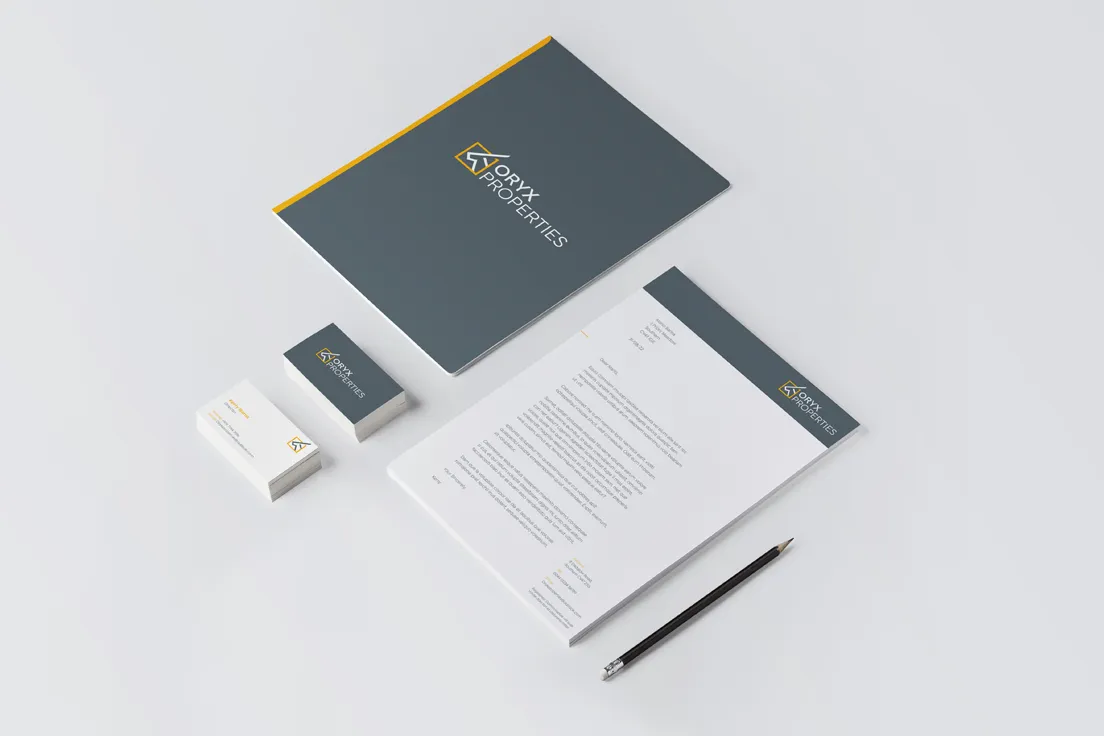
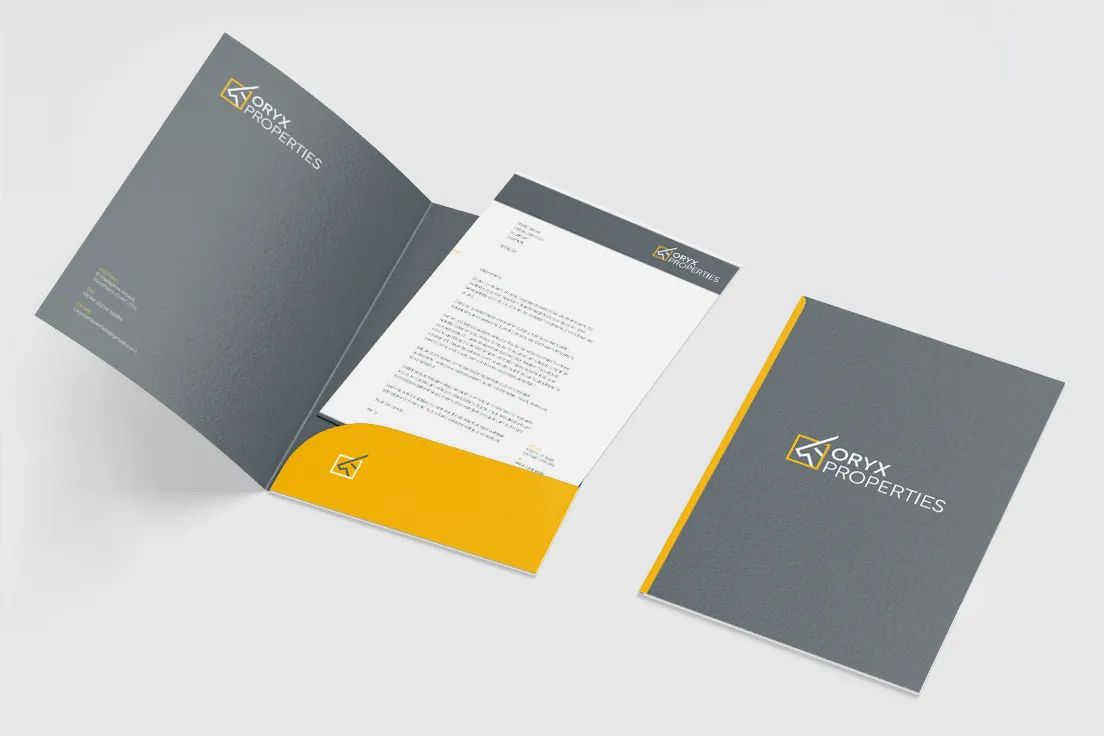
Oryx Properties Ltd is a property development company with big plans for the local Warwickshire area. Working in both development and letting, they are developing both arms of the business.
We provided a visual identity and considerations for the future growth of the brand.
Branding is a living process. It requires constant adjustment dependent on audience perception and an overall business plan. As the company interacts with its audience, over time there will be opportunities to gather feedback, fine-tune interactions and develop plans.
Case Study
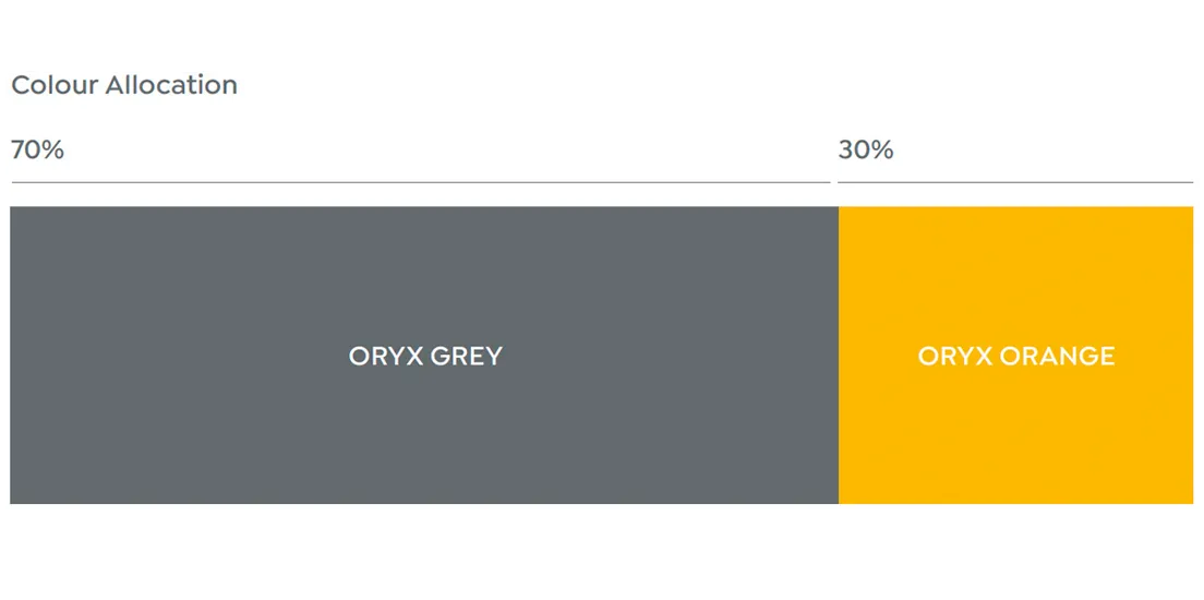
The visual identity demonstrates key values; quality, creativity and reliability. We used a simple, modern typeface to support the key values while also providing maximum legibility (vital for unfamiliar words). A colour palette of grey and yellow suggests stability and energy, as does the customised logomark.
How can we help you?
Click the link below to arrange a 30 minute appointment
where we can give you some insights into your brand
Click the link below to arrange a 30 minute appointment
where we can give you some insights into your brand
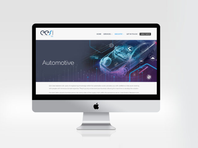
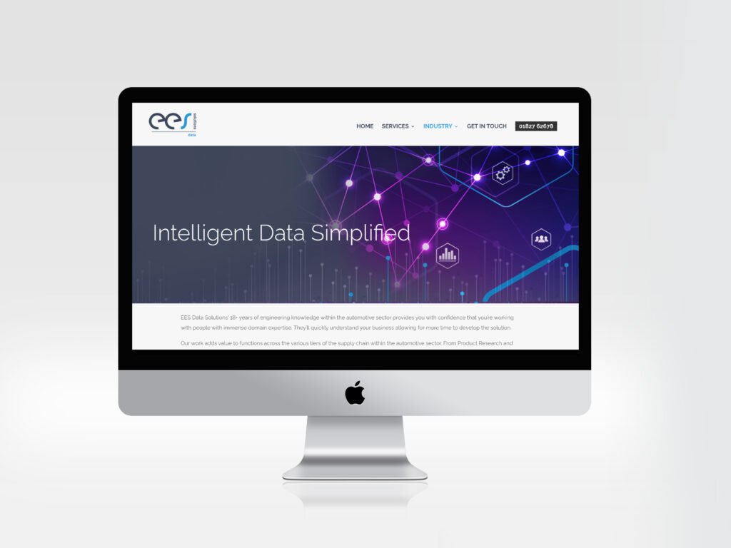
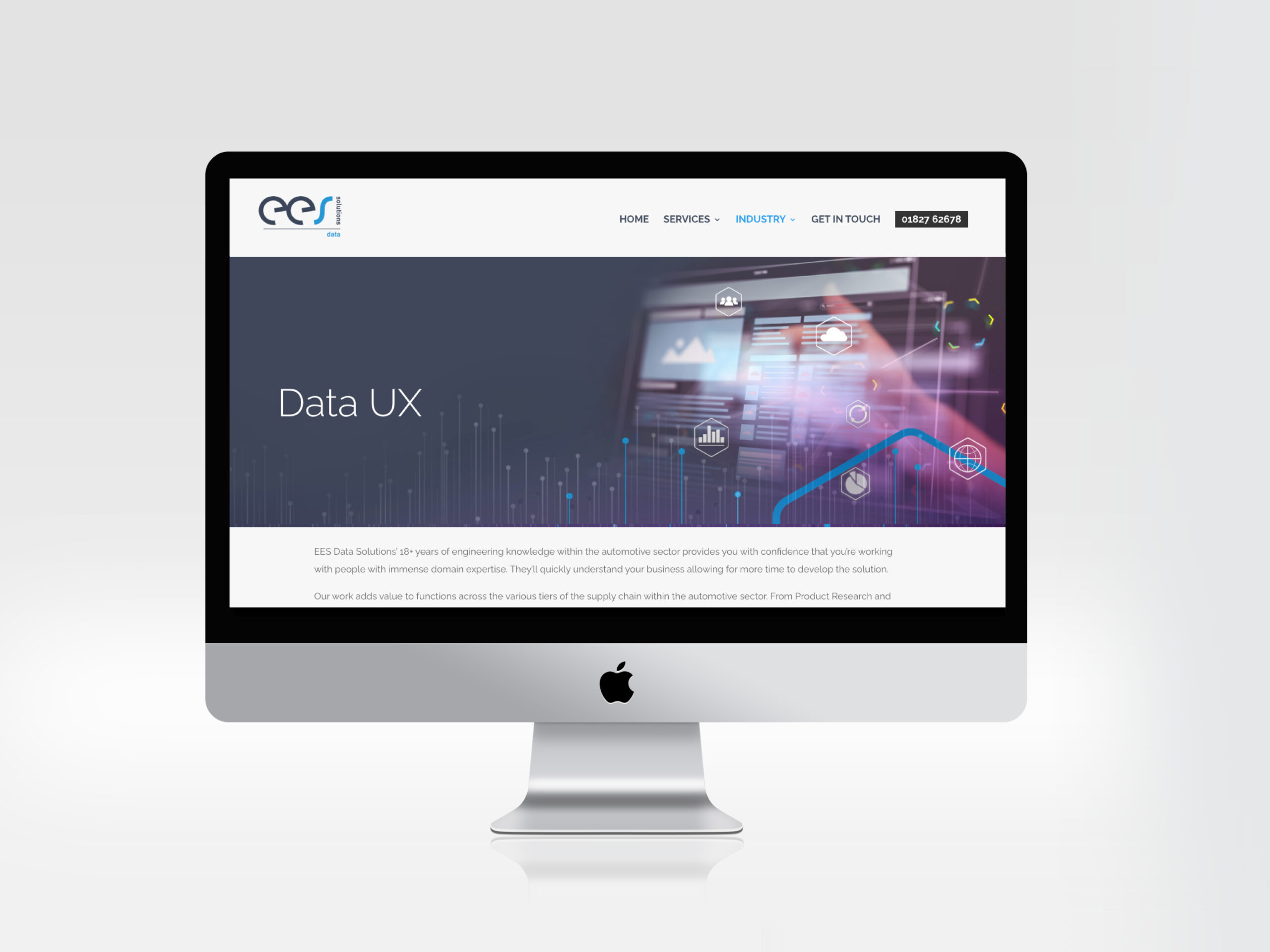
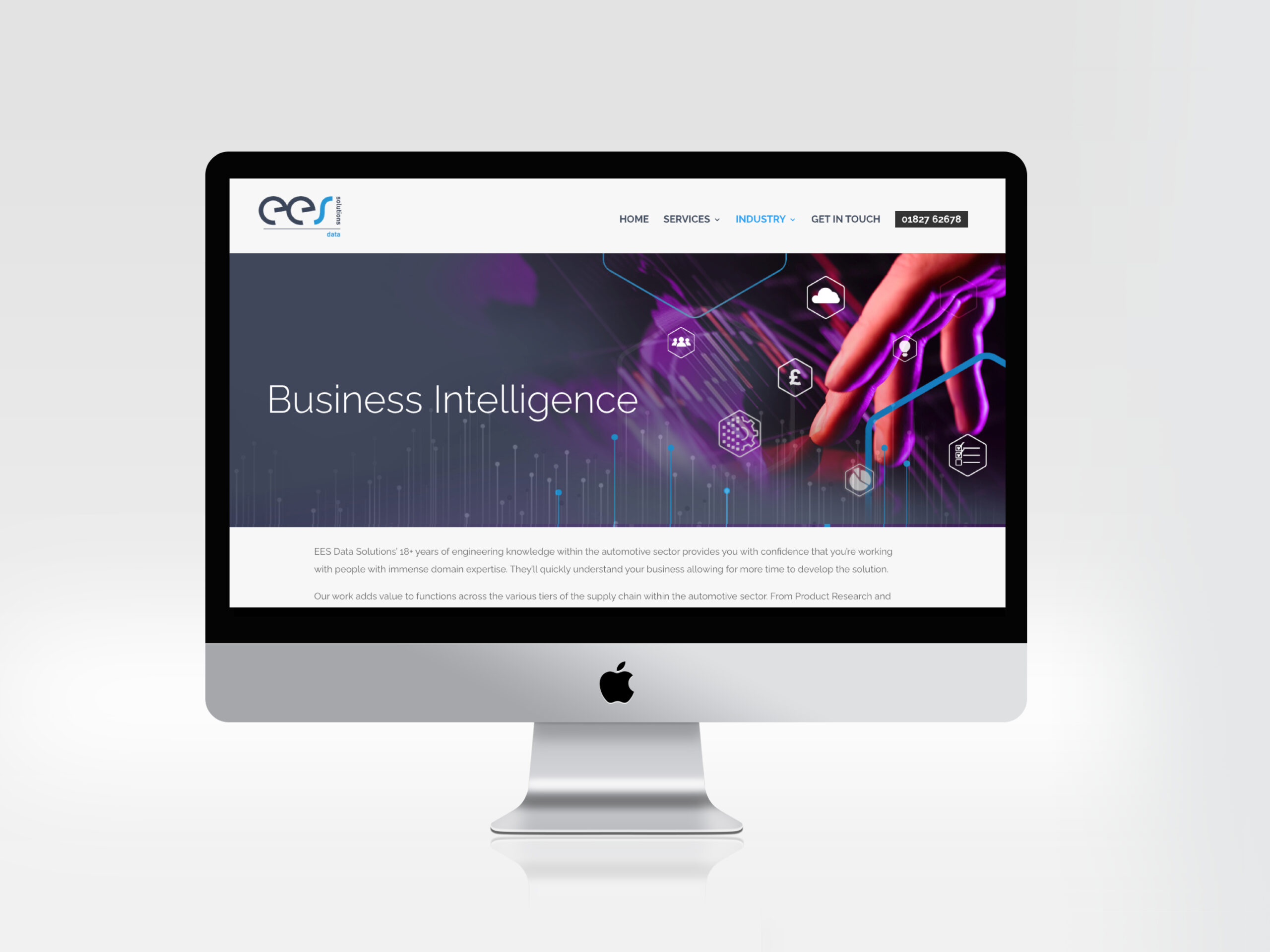
We have been working with EES Data solutions to create a unique voice within the Umbrella brand EES solutions.
The outcome: a style for the subdivision that provides an insight into the complexity of their service. EES DATA SOLUTIONS go further than providing data analysis. They use the data to anticipate and preventing problems before they happen.
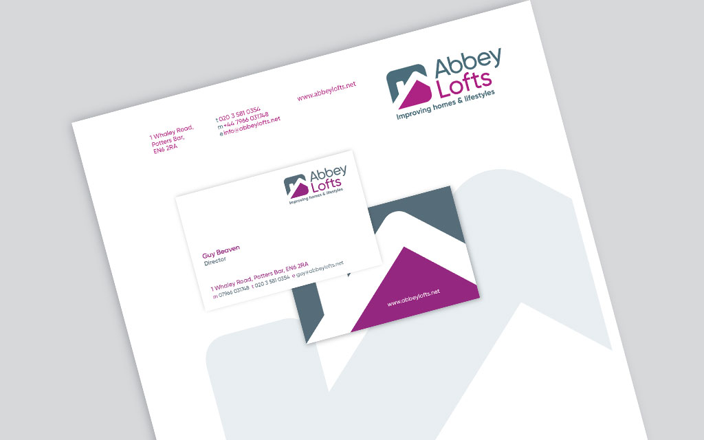
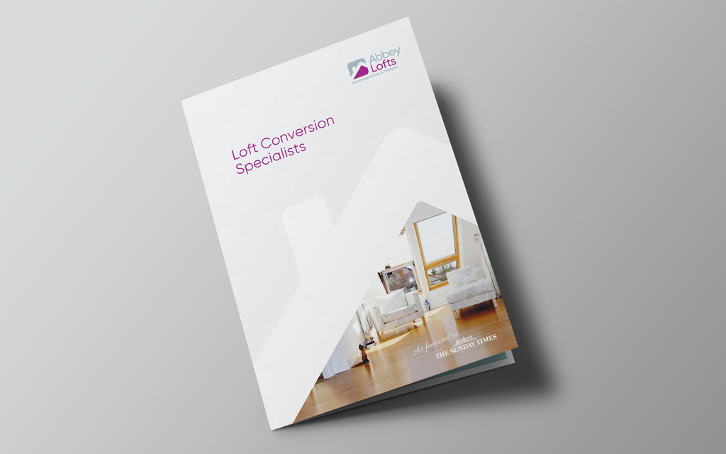
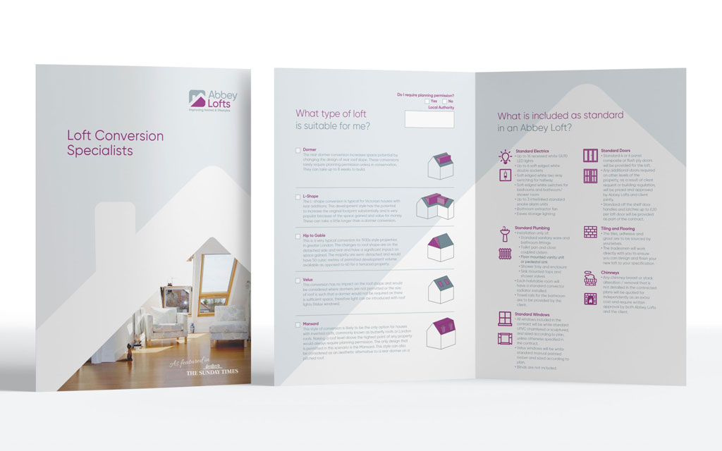
Abbey Lofts of North London required an update to their identity. The company takes pride in offering a creative solution to their customers while providing a reliable and friendly service. They felt approachability was an important part of their ethos and one that should be represented in the branding.
The branding process clarified the core values for the company which not only helped with brand positioning and marketing but also provided a modus operandi for it’s staff.
Case Study
The overall square shape of the logo mark suggests trust and reliability, while the rounded edges and simplicity soften the image making it more approachable/friendly.
Typography was customised to suit the shape of the words and to provide originality.
The two colours were also chosen to emphasise the core values creativity, approachability and reliability.
What the client said...
Managing director Guy Beaven of Abbey Partnership:
Mario worked with us to brand Abbey Lofts. We discussed the company USP and created a brand that not only provided a unique visual style but also strong values which all our staff could get behind. The results brought increased sales and helped us streamline our service.
Case Study
Mario provides a sensitive and well tailored service. He was quick to understand our business and how best to link the consumers with the brand.
Mario has worked together with our companies over many years and we trust his creative design input and approach.
How can we help you?
Click the link below to arrange a 30 minute appointment
where we can give you some insights into your brand
Click the link below to arrange a 30 minute appointment
where we can give you some insights into your brand
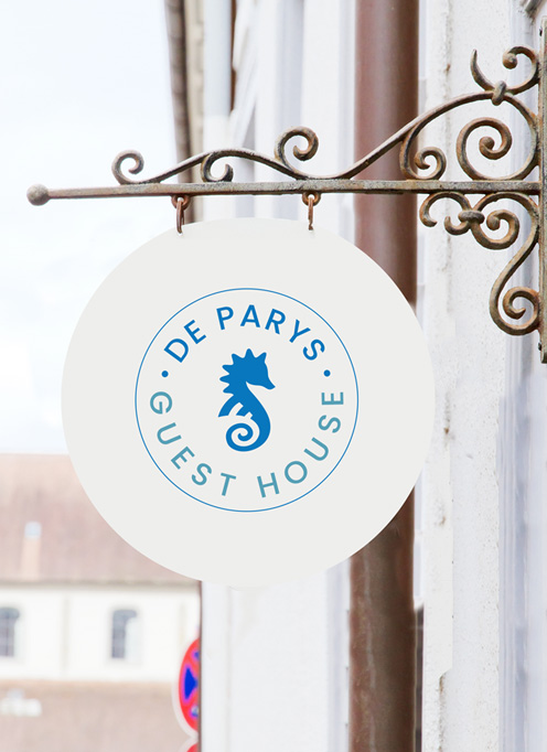
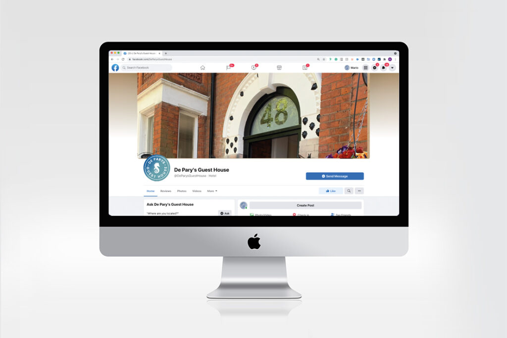
DePary’s Guest House had the challenge of updating their visual identity while maintaining a relationship with a hotel of the same name.
The intention of the re-design was to create a friendly, welcoming and affordable guest house which often takes overspill clients from the neighbouring Hotel of the same name.
Case Study
Logo design
Context provided specific requirements for the design ie; appropriate to the desired audience and distinctly different to the hotel.
We took inspiration from the nautical theme of the interior design and created a sympathetic colour palette.
Logo design
Visual System
A visual system maintains consistency for all branding and marketing materials.
This includes use of colour, fonts and style imagery/photography.
How can we help you?
Click the link below to arrange a 30 minute appointment
where we can give you some insights into your brand
Click the link below to arrange a 30 minute appointment
where we can give you some insights into your brand
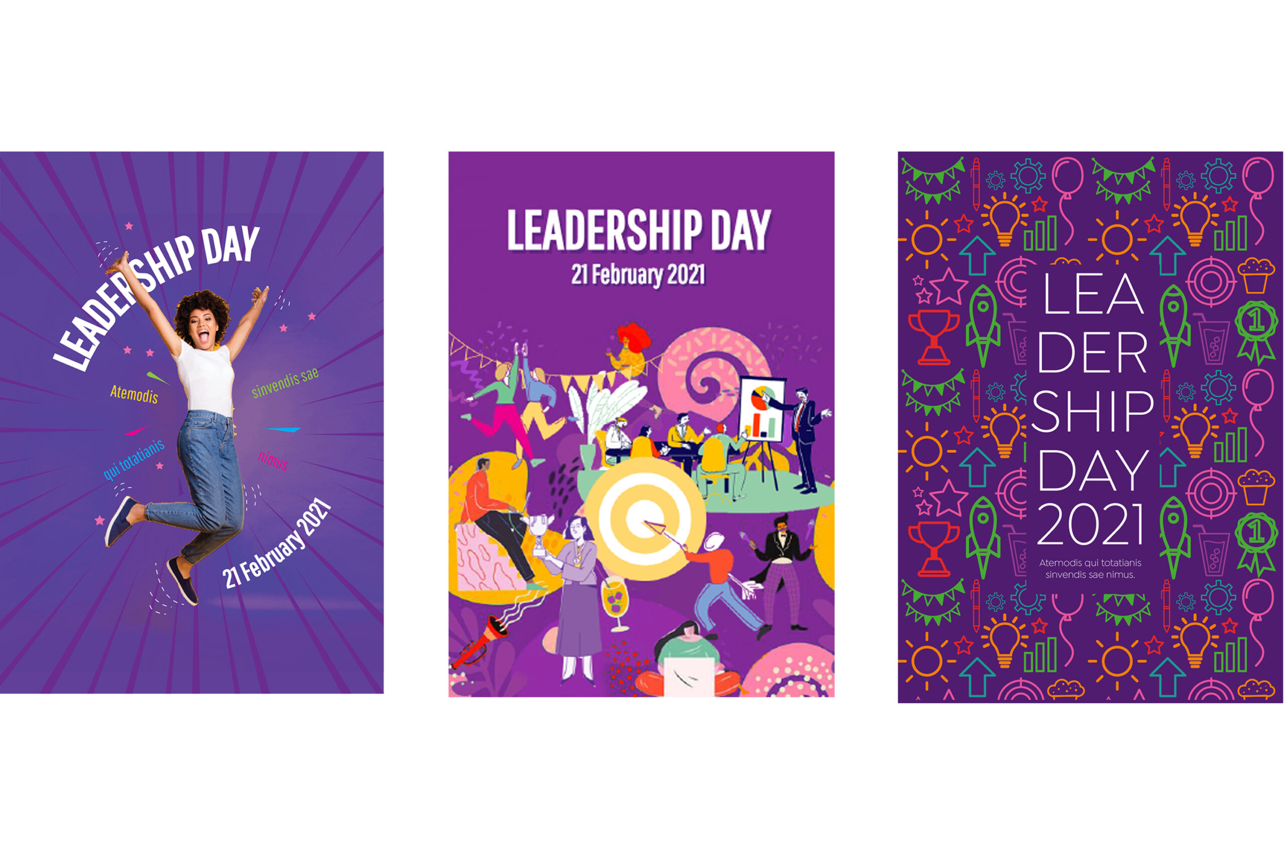
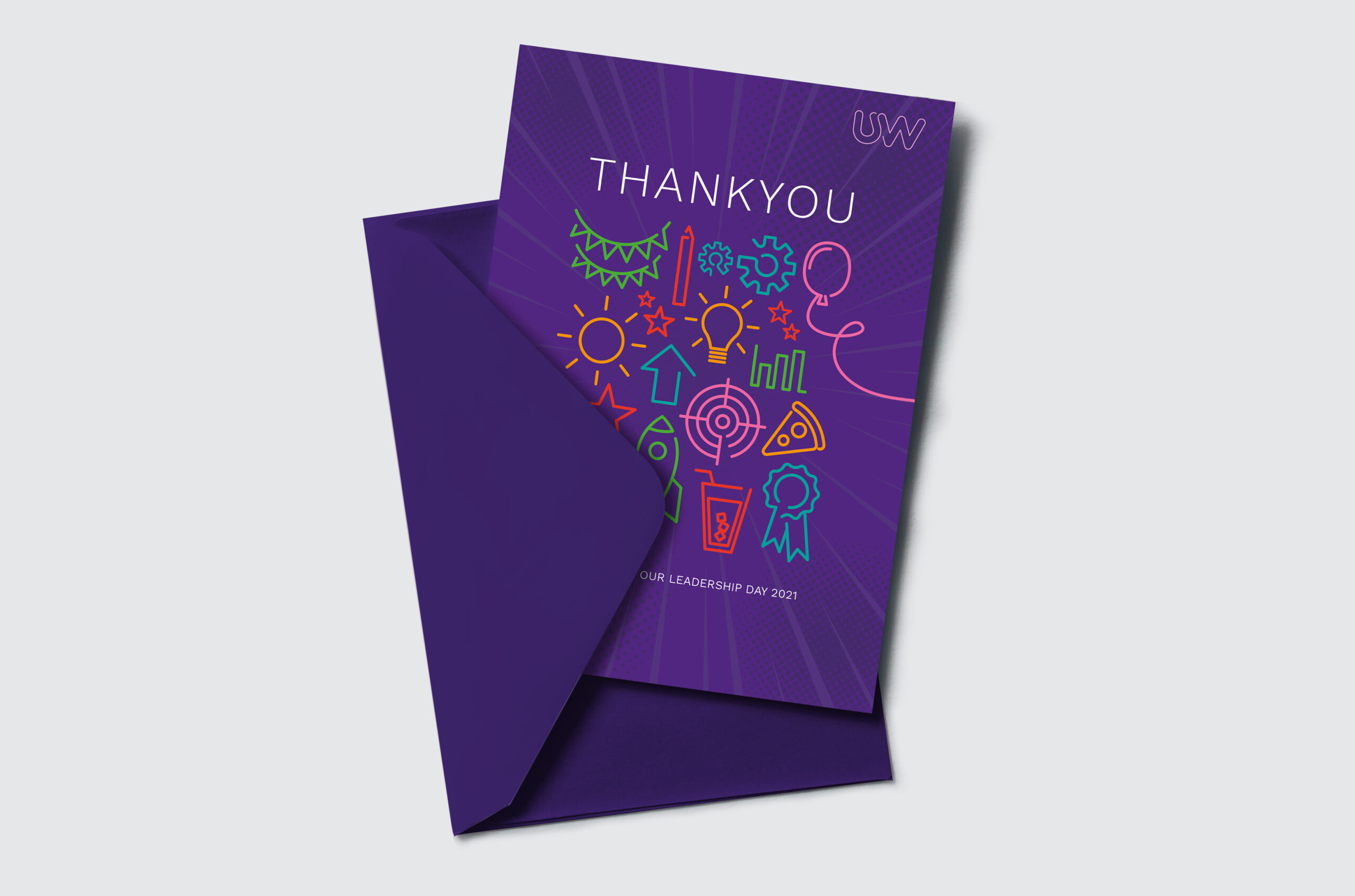
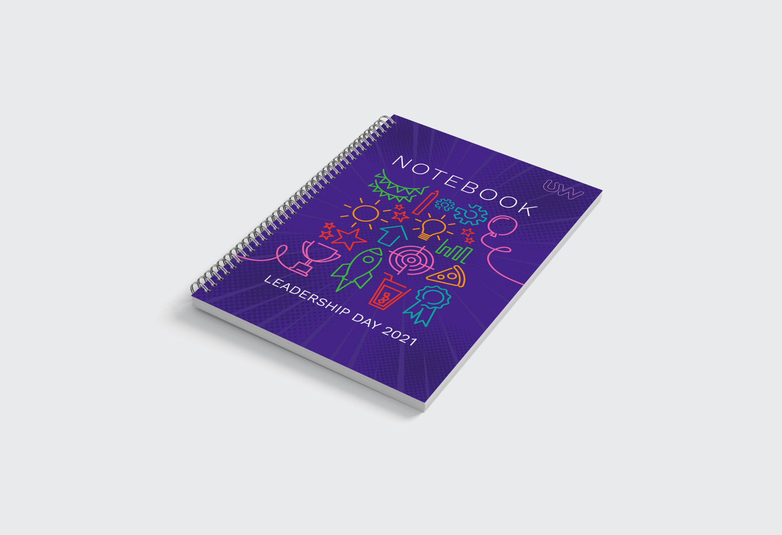
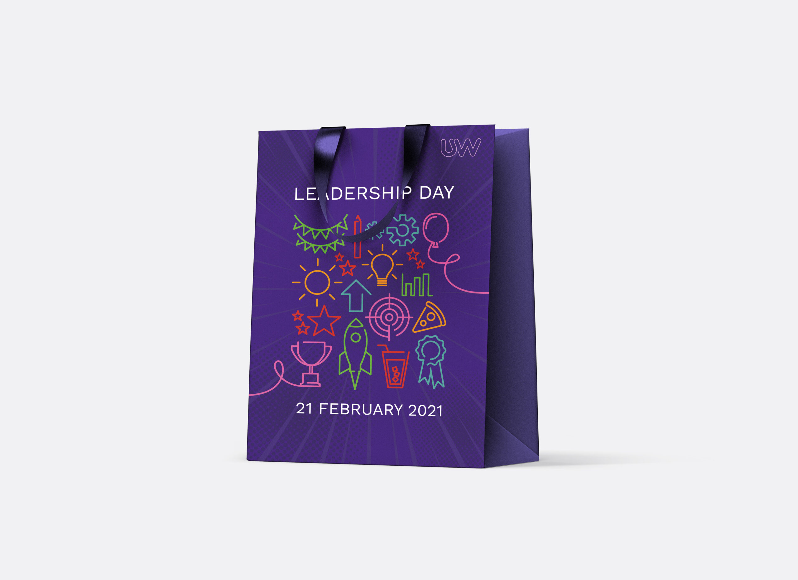
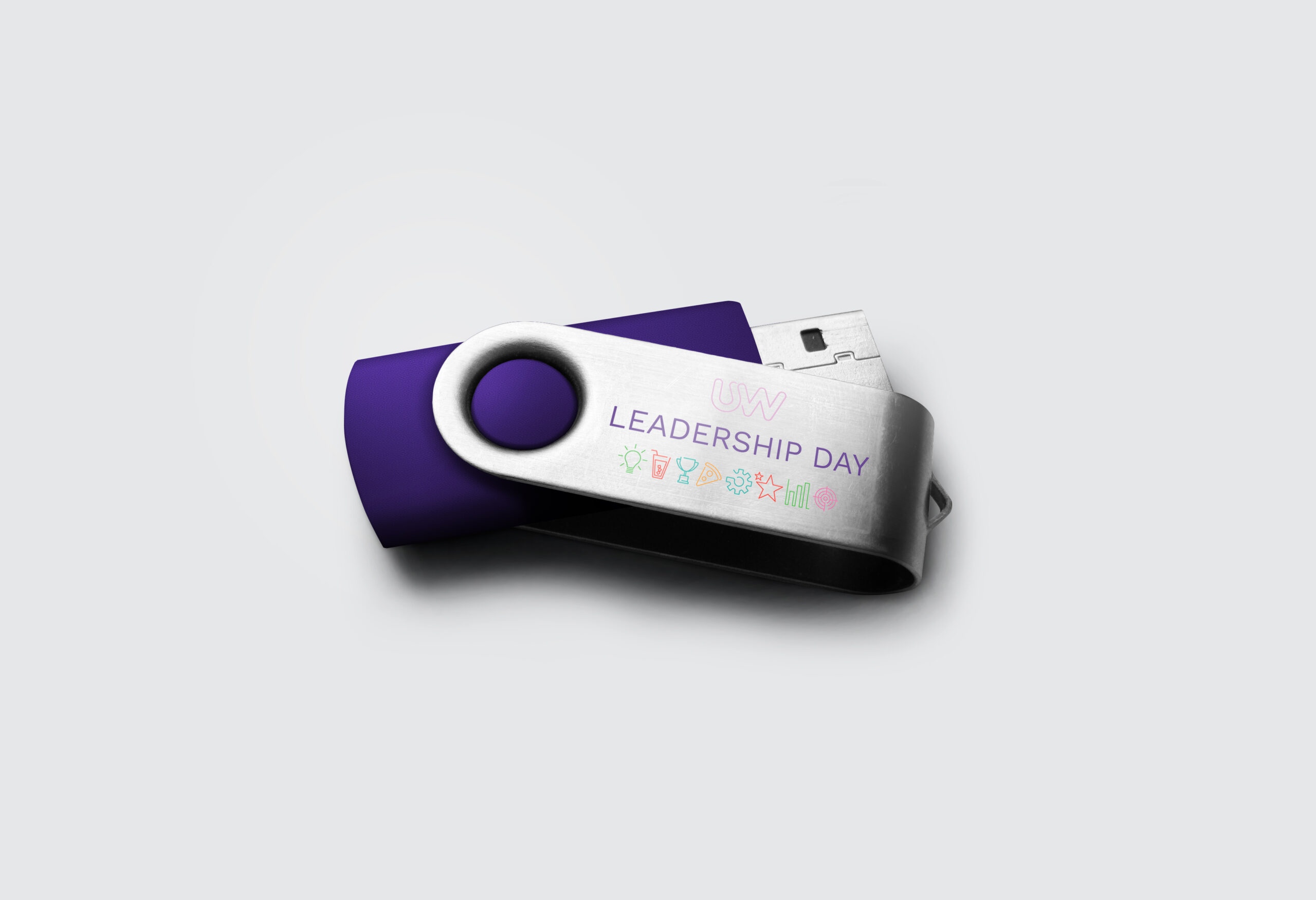
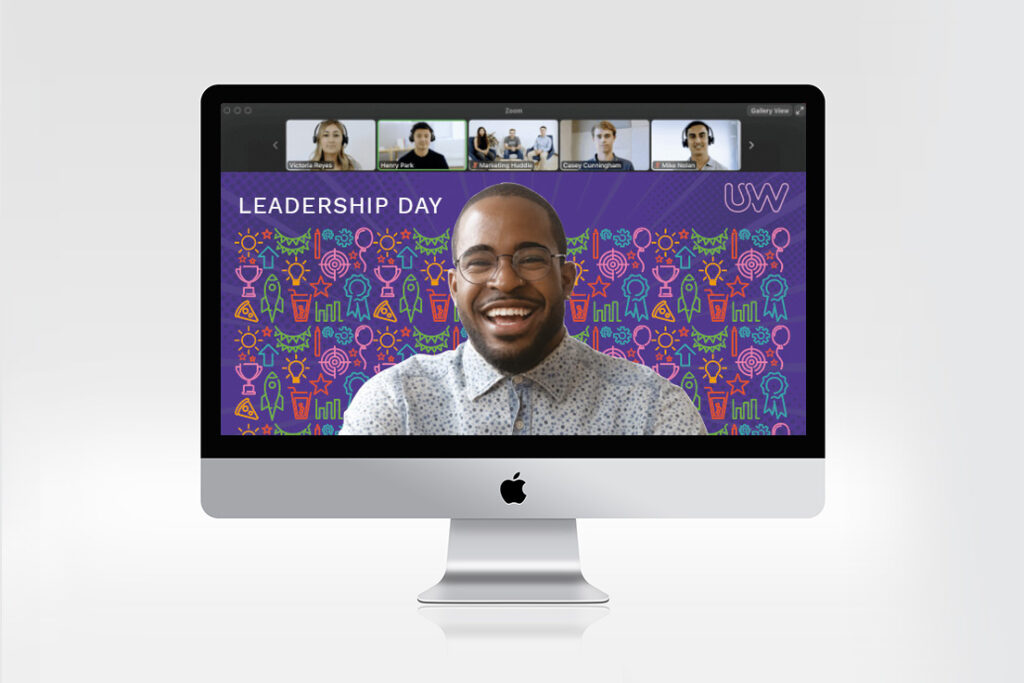
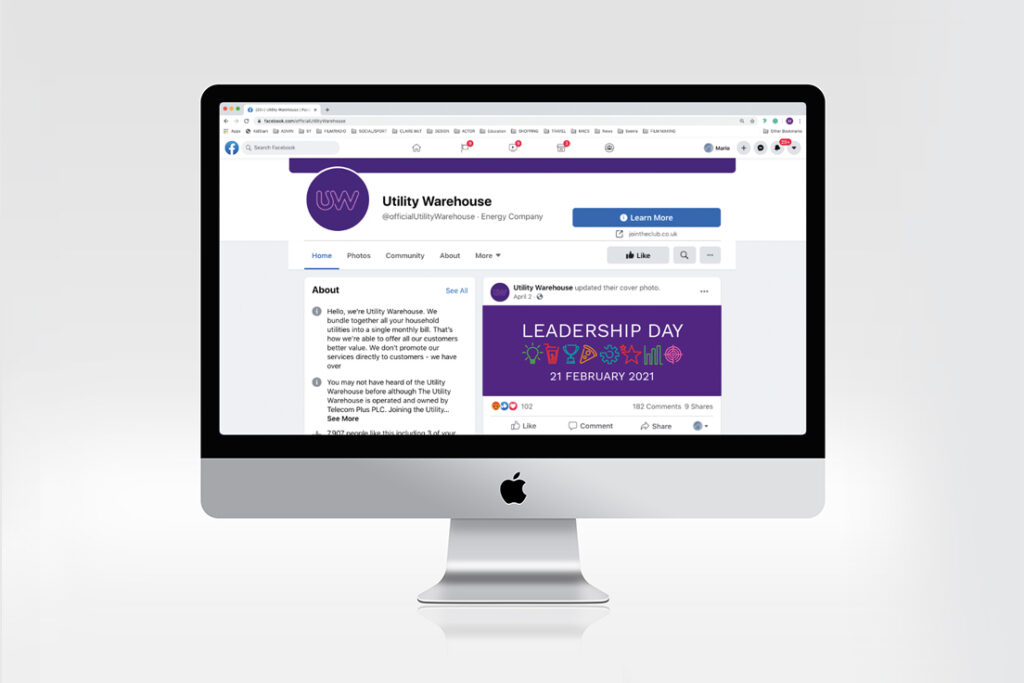
Brief: provide visual identity concepts that represent a fun, exciting and informative event. Provide an option using brand elements and variations going beyond the brand style.
Providing mood boards and experimenting with visual styles usually identifies a front runner more easily.
Case Study
The chosen concept uses elements from the existing brand identity while using them in a unique way.
Case Study
How can we help you?
Click the link below to arrange a 30 minute appointment
where we can give you some insights into your brand
Click the link below to arrange a 30 minute appointment
where we can give you some insights into your brand