Jigsaw Casas is an innovative real estate business on the South Costa Blanca in Spain.
They commissioned us to create a visual Identity to startup their operation. Their objective was to change the property buying/selling experience in Spain by providing a professional, honest and hassle-free one-stop solution.
By using a vibrant colour palette and unique motif we created a brand identity that stands out in the marketplace while also conveying Jigsaw’s simple and approachable ethos.
Identifying a clear market position helps inform visual style
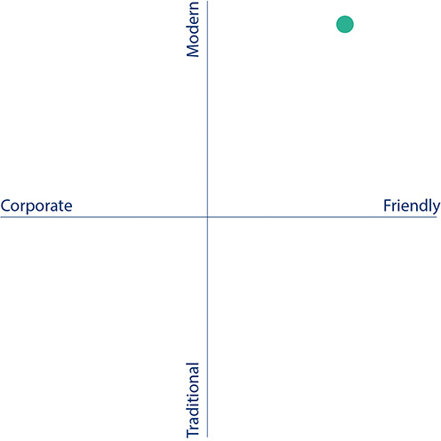
Researching competitors was important in helping us create an identity that stood apart and clearly identified what makes Jigsaw Casas different.
Most importantly for this project the necessity was to steer clear of the obvious Jigsaw images and to find a more unique interpretation of the idea.
We also focus on the distinctive qualities that the Identity should convey. Our keywords were Knowledgeable, Approachable, and Trustworthy.
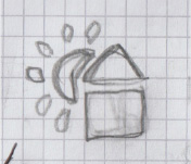
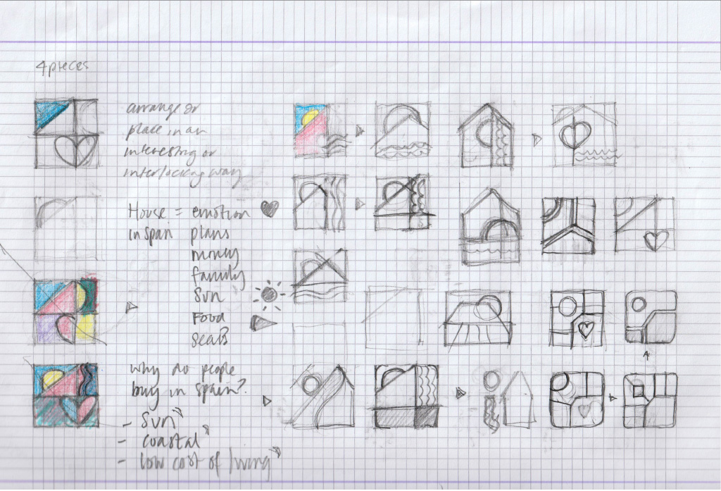
After initial concept sketches, we take the chosen ideas through to development and present them to the client.



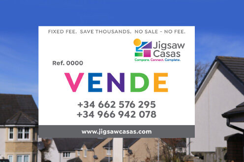
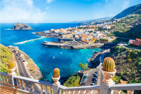

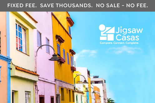
A visual identity is also created to support the requirements. This will include digital media, website, marketing and information graphics.
Brand guidelines ensure all subsequent design elements always follow the core values and unique visual style.

All rights reserverd
Copyright of Mario Barba Ltd 2024