Oryx Properties Ltd is a property development company with big plans for the local Warwickshire area. Working in both development and letting, they are developing both arms of the business.
We provided a visual identity and considerations for the future growth of the brand.
Branding is a living process. It requires constant adjustment dependent on audience perception and an overall business plan. As the company interacts with its audience, over time there will be opportunities to gather feedback, fine-tune interactions and develop plans.
Case Study
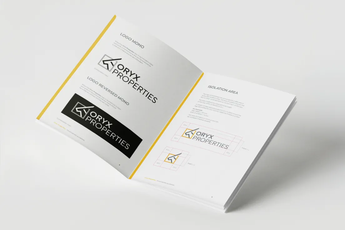
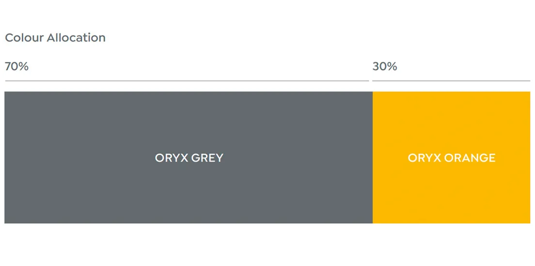
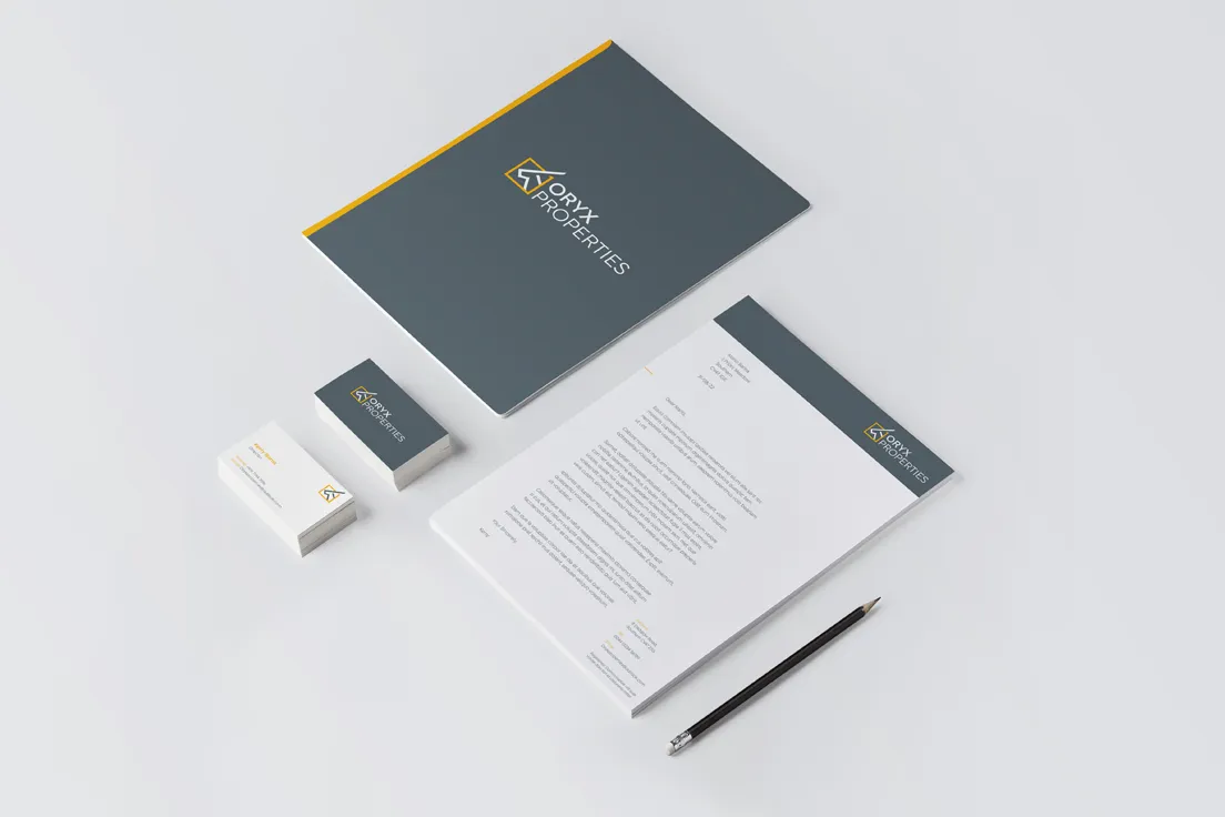
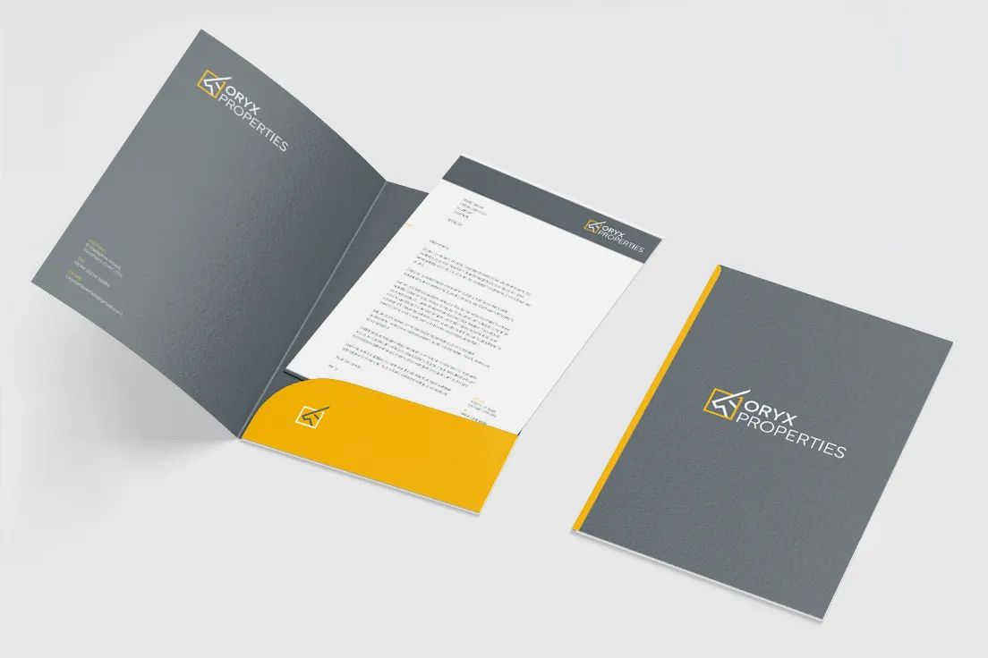
The visual identity demonstrates key values; quality, creativity and reliability. We used a simple, modern typeface to support the key values while also providing maximum legibility (vital for unfamiliar words). A colour palette of grey and yellow suggests stability and energy, as does the customised logomark.
How can we help you?
Click the link below to arrange a 30 minute appointment where we can give you some insights into your brand